Light Pink to Black Gradient
CSS GradientThe light pink to black gradient is crafted with 5 colors (#FDE6EE, #E3A8BC, #A9647D, #5C3140, #171012). Ready-to-use linear, radial, and conic CSS rules for modern web and mobile apps.
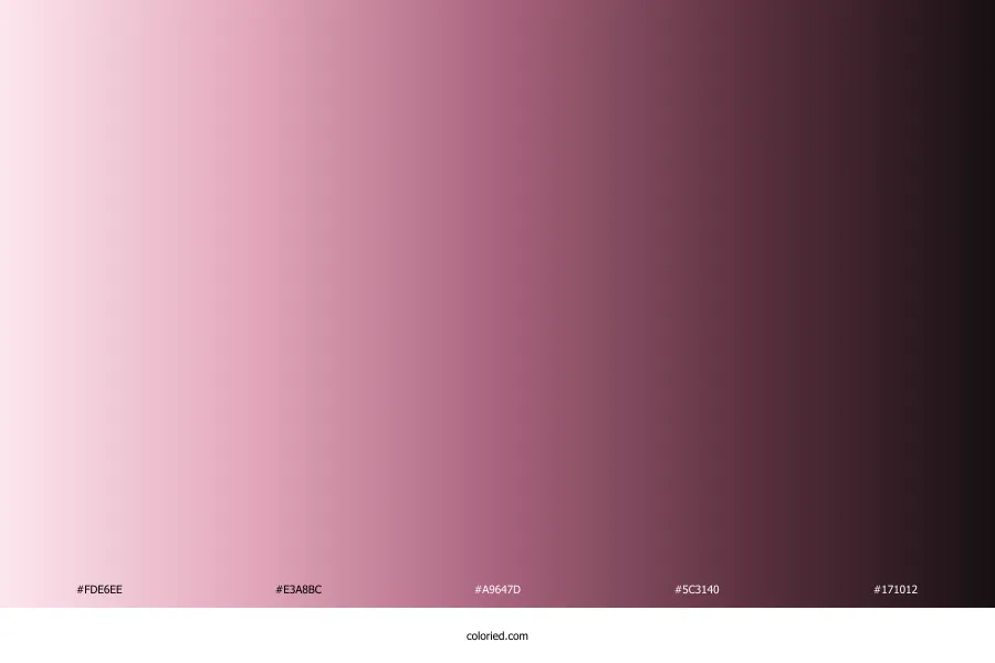
|
#FDE6EE
#E3A8BC
#A9647D
#5C3140
#171012
1. Gradient Color Stops
| Swatch | HEX | RGB | HSL | CMYK | OKLCH |
|---|---|---|---|---|---|
#FDE6EE | 253, 230, 238 | 339°, 85%, 95% | 0%, 9%, 6%, 1% | oklch(0.946 0.027 354) | |
#E3A8BC | 227, 168, 188 | 340°, 51%, 77% | 0%, 26%, 17%, 11% | oklch(0.792 0.074 357) | |
#A9647D | 169, 100, 125 | 338°, 29%, 53% | 0%, 41%, 26%, 34% | oklch(0.587 0.094 357) | |
#5C3140 | 92, 49, 64 | 339°, 30%, 28% | 0%, 47%, 30%, 64% | oklch(0.373 0.065 358) | |
#171012 | 23, 16, 18 | 343°, 18%, 8% | 0%, 30%, 22%, 91% | oklch(0.183 0.012 359) |
2. Gradient Variations & Styles
Linear Gradient
Radial Gradient
Conic Gradient
3. CSS Code & Declarations
Linear Gradient
background: linear-gradient(to right, #FDE6EE, #E3A8BC, #A9647D, #5C3140, #171012);
Radial Gradient
background: radial-gradient(circle, #FDE6EE, #E3A8BC, #A9647D, #5C3140, #171012);
Conic Gradient
background: conic-gradient(from 180deg at 50% 50%, #FDE6EE, #E3A8BC, #A9647D, #5C3140, #171012);
Tailwind CSS
bg-gradient-to-r from-[#FDE6EE] to-[#171012]
SCSS Variable
$gradient-light-pink-to-black-gradient: linear-gradient(to right, #FDE6EE, #E3A8BC, #A9647D, #5C3140, #171012);
4. Stop Accessibility & Contrast
#FDE6EEStop 1
On White:1.18:1
On Black:17.73:1
WCAG Pass
#E3A8BCStop 2
On White:1.98:1
On Black:10.59:1
WCAG Pass
#A9647DStop 3
On White:4.37:1
On Black:4.81:1
WCAG Pass
#5C3140Stop 4
On White:10.67:1
On Black:1.97:1
WCAG Pass
#171012Stop 5
On White:18.76:1
On Black:1.12:1
WCAG Pass
5. UI Preview with Gradient
Card Header
Light Pink to Black Gradient Banner
Stunning backgrounds for hero sections, marketing callouts, and modern card containers.
Modern Dark Mode
Gradient Glow
Use vibrant gradients as high-conversion button fills, text-gradients, or active focus rings.
Text Gradient
Similar Gradients
Gradient Ideas
About Light Pink to Black Gradient
Gradient Name
Light Pink to Black Gradient
Color Stops
5 Colors
First Color
#FDE6EE
End Color
#171012
Color Swatches