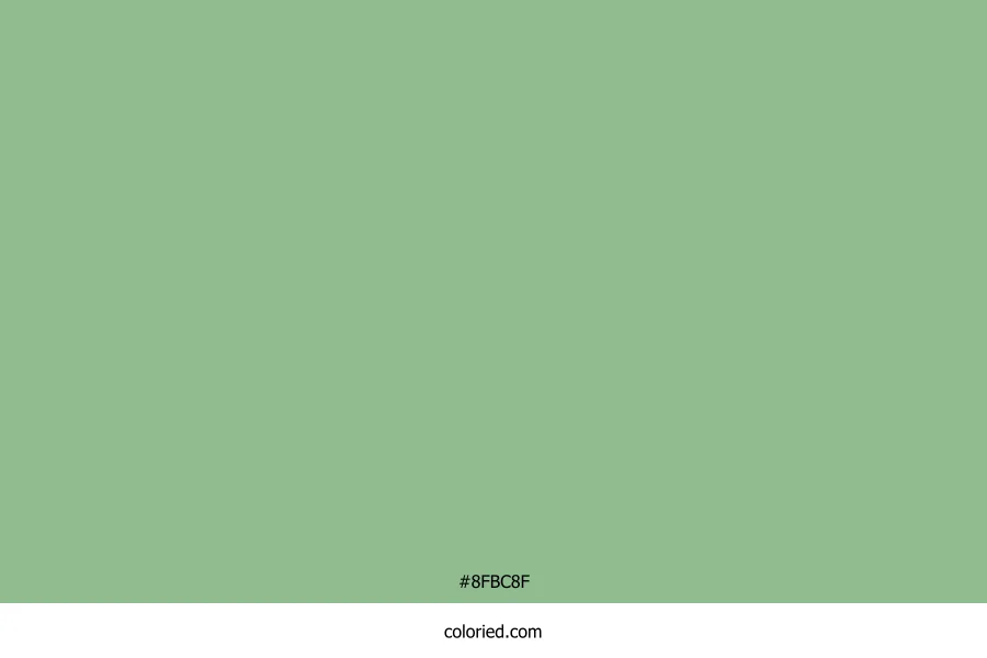
Light Sage Color

What Color is Light Sage?

Light sage is a pale green-gray. It looks calm like herbs.

#8FBC8F
FormatCodeImage
Hex
#8FBC8F
Light Sage Color Code
RGB
143, 188, 143
HSL
120, 25%, 65%
CMYK
24%, 0%, 24%, 26%
OKLCH
oklch(0.751 0.080 145)

Color Harmonies

Balanced color combinations based on color theory. Click to copy.

Analogous

Adjacent colors - harmony and unity

Monochromatic

Same hue, varied lightness - cohesive designs

Complementary

Opposite colors - high contrast

Split Complementary

Base + adjacent complements - balanced contrast

Triadic

Evenly spaced - vibrant palettes

Square

Four colors at 90° - bold combinations

Tetradic

Rectangle shape - rich variety

Compound

Analogous + complements - sophisticated

Accessibility & Contrast Checker

Ensure your color combinations meet WCAG accessibility standards for readability. Test text contrast against different backgrounds.

Sample Text

The quick brown fox jumps over the lazy dog.

Background: #FFFFFF2.15:1
AA AA Large AAA

Sample Text

The quick brown fox jumps over the lazy dog.

Background: #0000009.76:1
AA AA Large AAA

Sample Text

The quick brown fox jumps over the lazy dog.

Background: #F5F5F51.97:1
AA AA Large AAA

Sample Text

The quick brown fox jumps over the lazy dog.

Background: #1A1A1A8.09:1
AA AA Large AAA

Sample Text

The quick brown fox jumps over the lazy dog.

Background: #3333335.87:1
AA AA Large AAA

WCAG Guidelines: AA requires 4.5:1 for normal text, 3:1 for large text. AAA requires 7:1 for normal text, 4.5:1 for large text. Large text is 18pt+ or 14pt bold+.

Code Snippets

Ready-to-use code snippets for CSS, SCSS, Tailwind, and more. Click to copy.

CSS Variables
/* Light Sage Color */
:root {
  --color-light-sage-color: #8FBC8F;
  --color-light-sage-color-rgb: 143, 188, 143;
}

.element {
  background-color: var(--color-light-sage-color);
  color: rgba(var(--color-light-sage-color-rgb), 0.8);
}
SCSS
// Light Sage Color Variables
$light-sage-color: #8FBC8F;
$light-sage-color-rgb: 143, 188, 143;

// Usage
.element {
  background-color: $light-sage-color;
  border-color: darken($light-sage-color, 10%);
  box-shadow: 0 4px 6px rgba($light-sage-color-rgb, 0.2);
}
Tailwind Config
// tailwind.config.js
module.exports = {
  theme: {
    extend: {
      colors: {
        'light-sage-color': '#8FBC8F',
        'light-sage-color-light': '#BFD9BF',
        'light-sage-color-dark': '#609F60',
      },
    },
  },
}
JSON
{
  "name": "Light Sage Color",
  "hex": "#8FBC8F",
  "rgb": {
    "r": 143,
    "g": 188,
    "b": 143
  },
  "hsl": {
    "h": 120,
    "s": 25,
    "l": 65
  }
}

Visual Usage Examples

See how Light Sage Color looks in real-world design applications.

Website Header
Logo
HomeAboutContact
Card Component
Buttons
Background Usage

Heading Text

This is how body text appears on this background color. Good contrast is essential for readability.

Badges & Tags
NewFeaturedPopular
Gradients (Click to copy)
Complementary
Fade
Analogous
Radial